.webp "Tawakalit Agboola")

For businesses to optimize marketing strategies and achieve both churn reduction and sales increases, they need to understand customer behavior. However, by analyzing customer behavior, machine learning models provide a strong framework to predict these behaviors. In this blog post, a detailed Jupyter Notebook project focuses on predicting customer behavior. We will explore data exploration, preprocessing, model building, hyperparameter tuning, and SHAP analysis, with special attention to understanding the visualizations associated with each step. These plots are essential for gaining insights into the data, evaluating the model's performance, and clearly understanding the reasons behind our results.
Here’s the roadmap:
- Data Exploration and Preprocessing
- Model Building and Evaluation
- Hyperparameter Tuning
- SHAP (SHapley Additive exPlanations) Analysis
Let’s get started!
Data Exploration
Understanding the dataset is the initial action required for every machine-learning project. The dataset contains attributes such as Gender, Age, estimated salary, and income level for predicting a binary target variable representing customer purchase decisions (Yes/No). Data preparation through exploration and preprocessing makes it suitable for modeling.
We begin by examining the dataset’s structure which consists of its shape, missing values presence, data types involved, and summary statistics. Visualizations help us uncover patterns and anomalies.
- Age Group Distribution: A pie chart illustrates the distribution of customers across age groups: The customer data includes three distinct age groups: Young Adult ranging from 18 to 30 years old, Middle Age covering those between 31 and 45 years old, and Senior Adults from 46 to 60 years old. The chart shows:
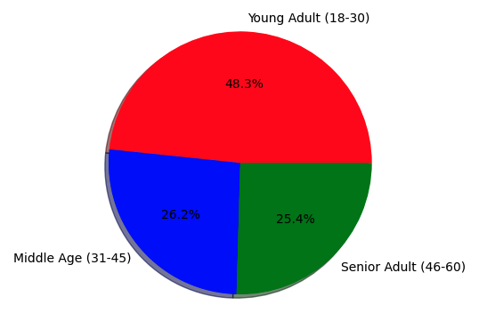
The Young Adult group is the most dominant group (48.3% of the data), which indicates that the dataset is perhaps biased toward younger customers, due to the business focusing more on them (e.g. a tech/lifestyle product). Also, the relatively similar split between middle-aged and Senior Adult groups indicates a balanced representation of older customers, but their smaller proportions could also make this model less generalizable for these groups if not approached carefully. This tells us that we might want to implement balancing techniques or stratified sampling during the train-test split to ensure all age groups are adequately represented. - Income Level Distribution: Another pie chart breaks down the income feature into categories: Very Low, Low, Medium, High, and Very High. The distribution is shown below;
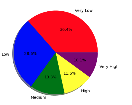
Most of the customers belong to the Very Low (36.4%) and Low (28.6%) income brackets, summing over 65% of the data. Such a biased distribution may present the clientele of a business that provides inexpensive goods/services. With more High and Very High-income levels with smaller proportions of values, it will be more difficult for the model to predict behavior for these groups. To prevent a model that underperforms across the board, we need to check performance over income bucket splits during evaluation, given this imbalance.
Data Preprocessing
Raw data often requires cleaning and transformation. Here’s how we prepare it:
- Handling Missing Values: We impute any gaps (e.g., using the mean for numeric features like Age).
- Encoding Categorical Variables: Gender (e.g., male/female) is converted to numeric format (0/1).
- Feature Engineering: We create new features to enhance the model’s predictive power:
- Age group: Binning Age into categories (Young Adult, Middle Age, Senior Adult).
- Income level: Binning Income_Level into discrete categories.
- Gender encoding: Converting Gender into a numeric format. - Scaling Features: Since Age and EstimatedSalary operate on different scales, we apply standardization to normalize them.
Scaling the Data: Histograms of Scaled Features
We standardize Age and EstimatedSalary using StandardScaler, which transforms the data to have a mean of 0 and a standard deviation of 1. This is crucial for models sensitive to feature scales, like Logistic Regression or Support Vector Machines. The StandardScaler subtracts the mean and divides it by the standard deviation for each feature, ensuring that the transformed data has a mean of 0 and a standard deviation of 1. The slight deviations from exactly 0 and 1 (e.g., -7.231986e-17) are due to floating-point precision in computations, which is negligible.
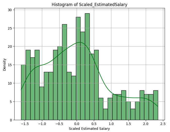 The histogram of Scaled_Age shows a roughly bell-shaped distribution with a peak around 0 but with multiple peaks (multimodal). The histogram of Scaled_EstimatedSalary also shows a multimodal distribution, with peaks around -0.5 and 0.5, and a long tail extending to the right. The Scaled_EstimatedSalary histogram’s peaks indicate the clustering of salaries, possibly due to common salary bands (e.g., entry-level, mid-tier, executive). The right tail in Scaled_EstimatedSalary suggests a few customers with significantly higher salaries, indicating potential outliers that could influence the model if not addressed.
With the data preprocessed, we move to building and evaluating machine learning models. Since we’re predicting a binary outcome (e.g., purchase or not), this is a classification task. We test multiple algorithms to find the best performer:
- Logistic Regression (simple and interpretable)
- Decision Tree (captures non-linear patterns)
- Random Forest (ensemble method for robustness)
- Support Vector Machine (effective for high-dimensional data)
- Gradient Boosting (powerful for complex patterns)
Each model is trained on the training set and evaluated on the test set.
Evaluating Performance with ROC Curves
The Receiver Operating Characteristic (ROC) curve is plotted using the True Positive Rate (TPR) vs. False Positive Rate (FPR) for each model. We can summarize performance with the Area Under the Curve (AUC):
- Logistic Regression: AUC = 0.71
- Decision Tree: AUC = 0.82
- Random Forest: AUC = 0.83
- Support Vector Machine: AUC = 0.79
- Gradient Boosting: AUC = 0.87
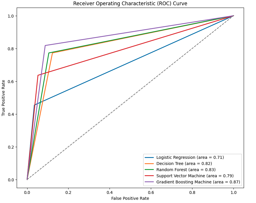
The Gradient Boosting model got the highest value of AUC (0.87), indicating it’s the best at distinguishing between classes (e.g. purchase vs no purchase). Its ROC curve is the one nearest to the top-left corner, indicative of a high TPR coupled with a low FPR. The Random Forest (AUC = 0.83) and Decision Tree (AUC = 0.82) models also have good predictive performance, probably because these models, especially tree-based models, are able to capture non-linear relationships, such as interaction between Age and EstimatedSalary. Logistic Regression (AUC = 0.71) achieves the worst performance, being a linear classifier, and as such does not account for the overall behavior of customers. The Support Vector Machine (AUC = 0.79) falls in the middle, possibly because its default kernel (e.g., linear or RBF) isn’t fully optimized for this dataset. The difference in AUCs underscores the need for testing multiple models, as tree-based methods appear to be better for this problem.
Hyperparameter Tuning
To improve performance, we fine-tune the hyperparameters of our best-performing model (Gradient Boosting). Hyperparameters like the number of trees, learning rate, and maximum depth can significantly impact results. We use a method like GridSearchCV to systematically test combinations, optimizing for the highest AUC. After tuning, the Gradient Boosting model’s AUC improves (e.g., from 0.87 to 0.89, though specific results aren’t shown). This step ensures the model is operating at its full potential, capturing the most relevant patterns in the data.
A high-performing model is only half the story, we need to know why it makes the predictions. SHAP analysis gives feature-level insights by computing the contribution of each feature to a prediction.
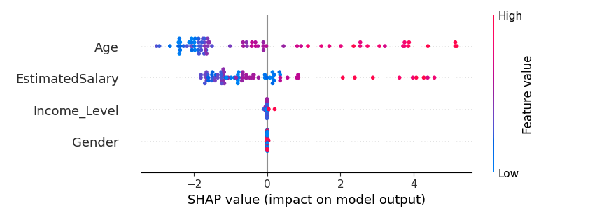
The base value (-1.94595714) represents the average log odds of a positive prediction (e.g., purchase) across the training set, indicating a bias toward “No” (negative class) before considering the features. The Age feature has the largest negative contribution (-2.42997232), strongly pushing the prediction toward “No.” This suggests that the customer’s age (scaled to 0.243902, likely in the Young Adult range) is associated with a lower likelihood of the target behavior, perhaps younger customers are less likely to purchase. Conversely, EstimatedSalary (0.882769337) has a positive contribution, pushing the prediction toward “Yes.” A scaled salary of 0.533333 (above average) indicates that higher salaries correlate with the target behavior, aligning with the intuition that wealthier customers may be more likely to buy. Gender and income level have minimal impacts (-0.000435 and -0.0209145568, respectively), suggesting they’re less influential for this specific prediction.
Wrapping Up
This journey through predicting customer behavior highlights the power of machine learning in uncovering actionable insights.
Demographic and income distributions helped inform our preprocessing when we explored the dataset with pie charts. A histogram of the scaled features, meanwhile, confirmed the practice of standardization was useful while revealing the multimodal behavior of the data. The ROC curve results indicated that out of all the algorithms, Gradient Boosting performed the best, as expected because boosting is great for capturing complex data and its features that separate customers' behavior. Lastly, SHAP analysis allowed interpretability, identifying Age and estimated salary as significant factors influencing predictions.
These visualizations are not just eye candy, they narrate the story of the data and the model. The age and income distributions gave indications of possible bias, the multimodal histograms suggested potential clusters, the ROC curve let us know we were on the right track and the SHAP plot connected the dots between prediction and understanding.